Lab9
Control
Angular speed control
You will likely need to low pass filter the gyroscope values - read up on how we did that with a complementary LPF in Lecture 4, slide 23.
Low pass filter:
const float alpha = 0.1;
float history_gyr = 0.0;

float LPF_gyr(float curr_gyr) {
    float filtered_gyr = alpha * curr_gyr + (1 - alpha) * history_gyr;
    history_gyr = filtered_gyr;
    return filtered_gyr;
}
One way to make the robot spin even slower is to block one set of wheels while turning the others. This means that your robot is now driving in a slight circle (rather than on-axis), which will make post-processing of data slightly more difficult, but allow you to capture data more reliably.
I didn’t use this method. Instead, I always let the left wheel and right wheel spin under opposite control values.
std::pair<int16_t, int16_t> angle_speed_pid(int16_t error) {
		return std::make_pair(-control, control);
}
Please quantify and/or use graphs to document that your PID controller works well, and upload a video that shows how your robot turns.
if (yaw > 400) {
    stop();
    auto_running = false;
}
keepYawSpeed(20, -filtered_gyr);
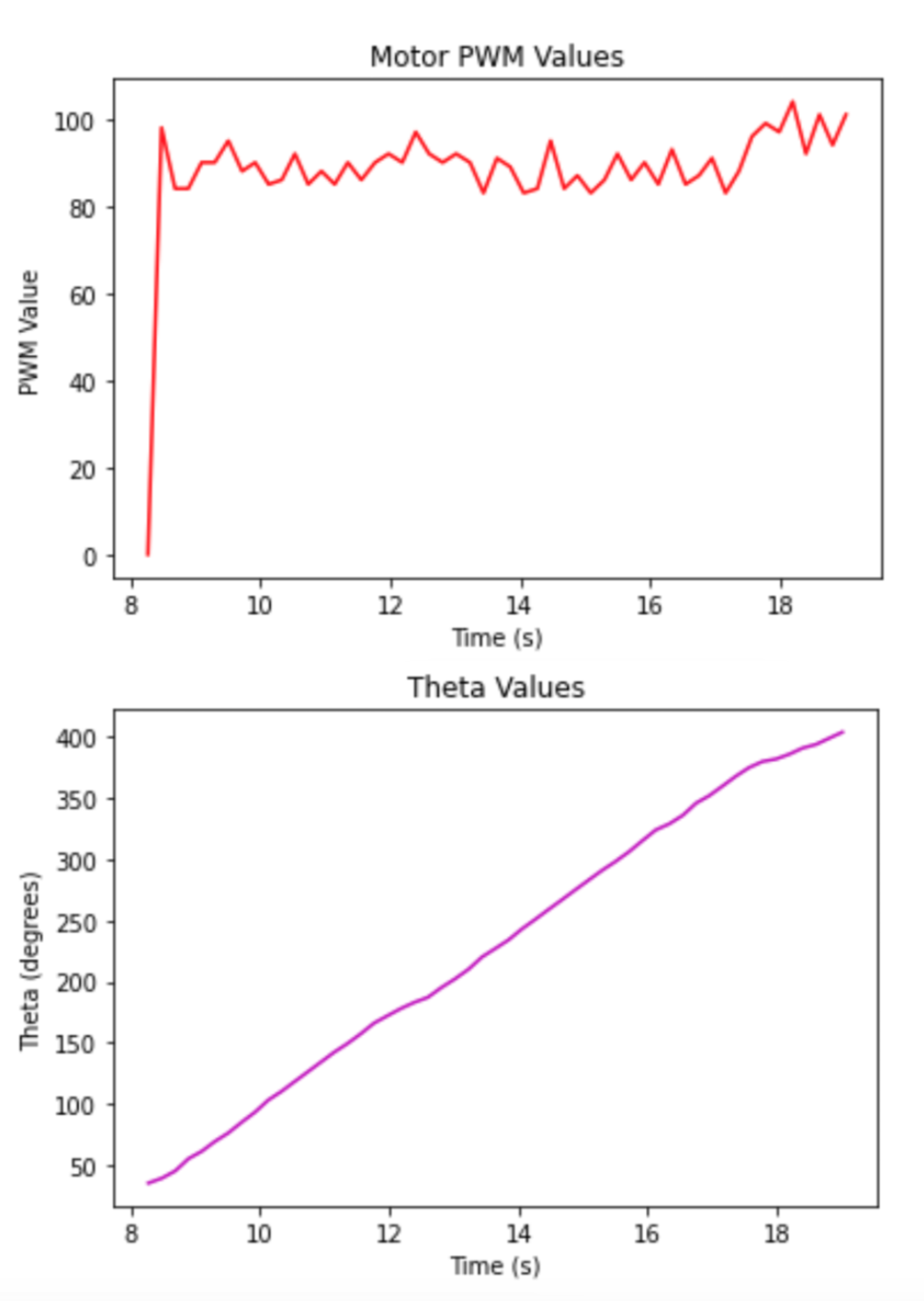
Given the slowest speed you are able to achieve, how much does the orientation of the robot change during a single measurement? If you were spinning in the middle of a 4x4m2 empty, square room, what kind of accuracy can you expect?
About 5 degrees
Read data
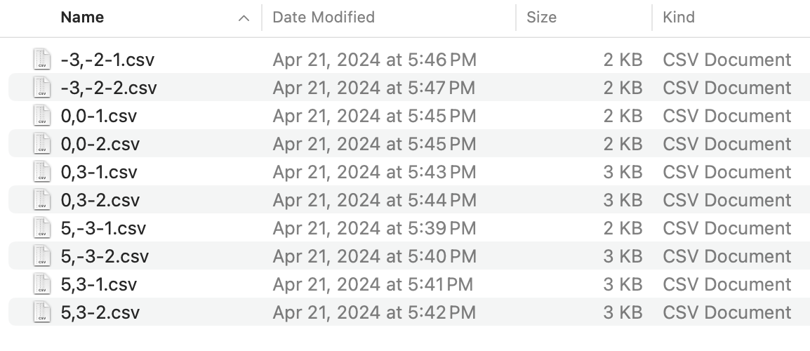
On every marked point, I collected 2 copy of data,
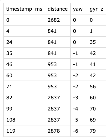
each csv file looks like this,
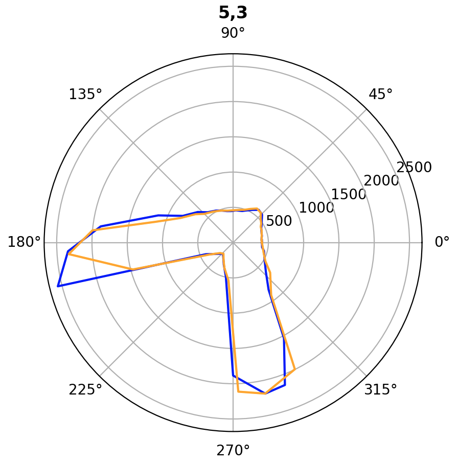
Plot Polar Graph
The following code read raw data files and convert yaw angle and distance towards x and y coordinates.
poses = ["-3,-2", "0,0", "0,3", "5,-3", "5,3"]

for pos in poses:
    # create a new polar plot
    fig, ax = plt.subplots(subplot_kw={'polar': True})

    file_path_1 = os.path.join(csv_folder, pos + "-1.csv")
    file_paht_2 = os.path.join(csv_folder, pos + "-2.csv")

    df1 = pd.read_csv(file_path_1)
    df2 = pd.read_csv(file_paht_2)

    degree_angles = df1["yaw"].tolist()
    rad_angles = [elem * -np.pi / 180 for elem in degree_angles]
    distances = df1["distance"].tolist()
    distances = [dist + 40 for dist in distances]

    ax.plot(rad_angles, distances, color="blue")

    degree_angles = df2["yaw"].tolist()
    rad_angles = [elem * -np.pi / 180 for elem in degree_angles]
    distances = df2["distance"].tolist()
    distances = [dist + 40 for dist in distances]

    # use two different colors to display two series of data
    ax.plot(rad_angles, distances, color="orange")

    plt.title(pos, loc='center', fontweight='bold')
    plt.show()
The polar plots:
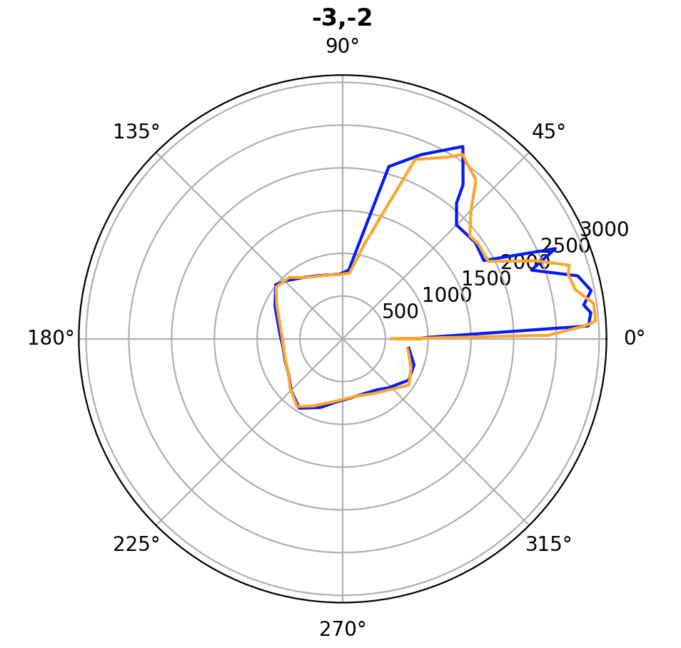
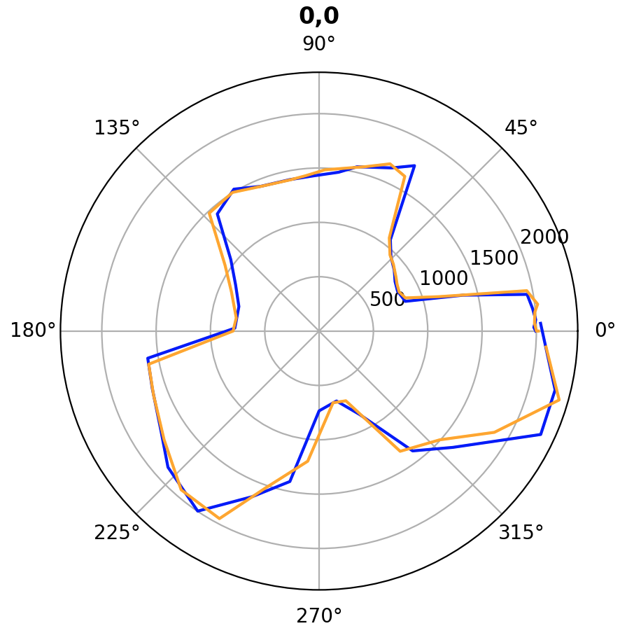
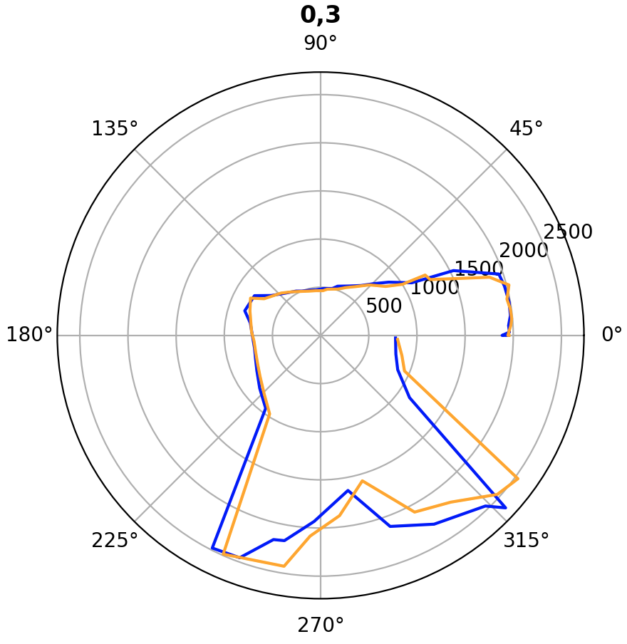
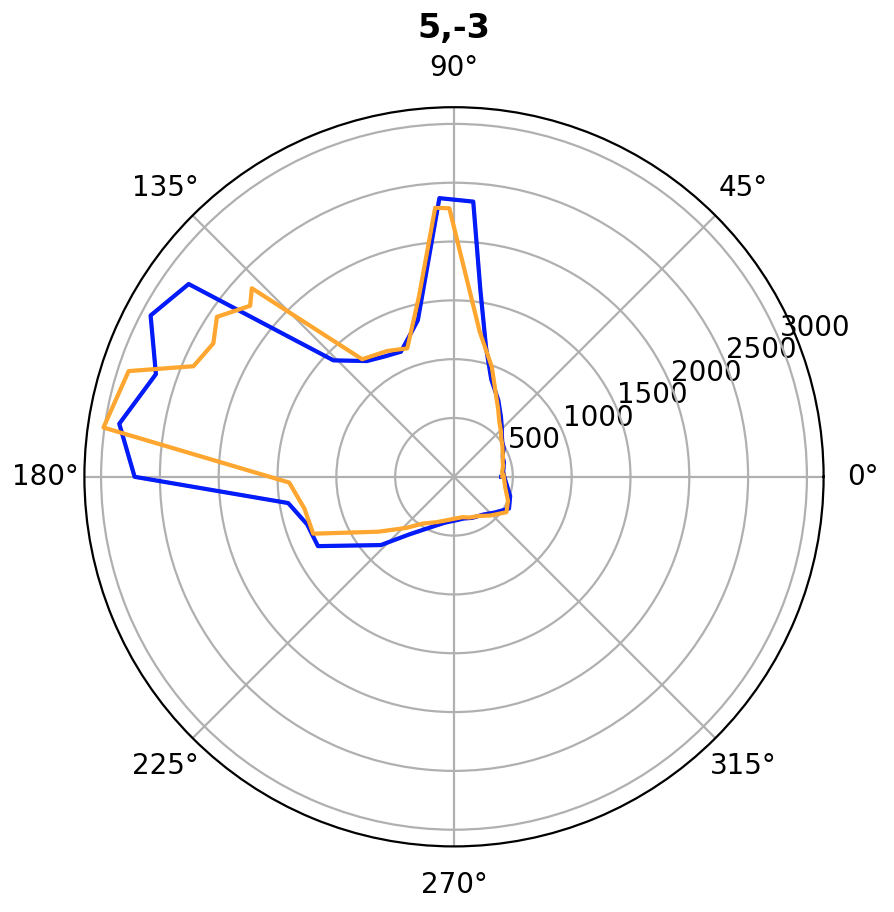
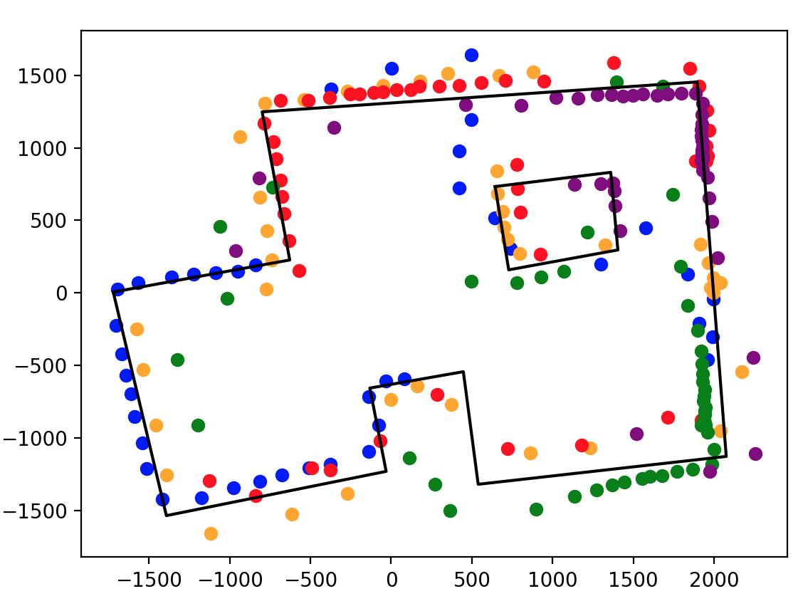
Merge and Plot your readings
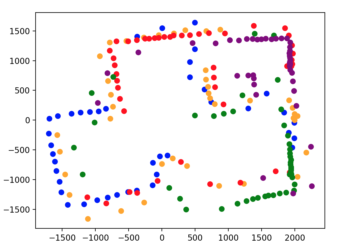
I use five different colors to display data that are read from five different positions.
poses = ["-3,-2", "0,0", "0,3", "5,-3", "5,3"]
colors = ["blue", "orange", 'red', 'green', 'purple']
suffixes = ["-1.csv", "-2.csv"]

for pos, curr_color in zip(poses, colors):
    x_base, y_base = list(map(int, pos.split(",")))
    for suffix in suffixes:
        file_path = os.path.join(csv_folder, pos + suffix)
        df = pd.read_csv(file_path)

        degree_angles = df["yaw"].tolist()
        rad_angles = [elem * -np.pi / 180 for elem in degree_angles]

        distances = df["distance"].tolist()
        x_coord = [(dist + 40) * np.cos(rad_angle) + x_base * 304 for dist, rad_angle in zip(distances, rad_angles)]
        y_coord = [(dist + 40) * np.sin(rad_angle) + y_base * 304 for dist, rad_angle in zip(distances, rad_angles)]

        plt.scatter(x_coord, y_coord, color=curr_color)

plt.show()
Graph:
Convert to Line-Based Map
x_wall1 = [-1721, -628, -799, 1895, 2075, 539, 447, -132, -31, -1392, -1721]
y_wall1 = [6, 227, 1248, 1454, -1127, -1319, -543, -656, -1230, -1535, 6]

x_wall2 = [644, 1360, 1404, 728, 644]
y_wall2 = [733, 831, 296, 159, 733]
Line-based map is shown as below,
